PechaKucha Anyone?

Last week we presented lightning pitches on geospatial visualization projects – all very interesting ones I might add – for consideration as the 2013 CHI fieldschool final project. The creativity of the fieldschool collective is impressive, equally amazing is the effort required to advance from brainstorming to production of a vision document.  We have progressed from our individual concepts to selection of a project and  establishment of themes, workflow, time frame, and milestones for the group. The processes involved in generating ideas, focusing direction, and outlining criteria for the project brought to mind a larger question I oftentimes contemplate regarding heritage collection appraisal and accession.

I don’t subscribe to the notion of memory institutions as neutral repositories.  My thinking is more in keeping with former Society of American Archivists president and historian, Randall Jimerson.  Jimerson advises cultural memory practitioners to be cognizant of exerting “archontic power” in relation to the intersection between history, memory, social power, justice, and heritage materials.

The notion of being professionally accountable for influencing the construction and preservation of future generation’s memory, informed my pitch.  Comparing UNESCO’s World Heritage Sites in the U.S. and National Park Service National Heritage Areas; I presented an idea to examine each organization’s heritage listings, noting the absence of over-lap between the agencies and  proposed mapping  heritage resources that have not been included.  As a result of my pitch, I drafted the following concept map:

concept4

I intend to use this as a creative problem-solving device to parse the concept of  “showing hospitality to the stranger” (Jimerson, 2009) when addressing archival silences – in this case, heritage silences – to identify narratives for inclusion. This could be a means for locating communities with heritage materials for preservation, digitization, and database management activities.

Jimerson, R.C. (2009). Archives power: Memory, accountability, and social justice. Chicago: Society of American Archivists.


You mean we have to play nice with others?

For the past 4 days we have been developing and planning our final project. It has been an experience to say the least. Trying to find agreement between 10 people who have really never designed a project before has been an interesting and enlightening process for me. And it has to be completely finished in only 2 weeks!!

I honestly must admit that I’ve never been a member of a team like this. I hate team projects normally. I’m accustomed to choosing my own ideas and following them to my precise specifications, whether that be in a class paper, a semester project, or my senior thesis. And I spent all of grade school and high school being that one kid who runs things. College has kind of trained of that out of me since professors are pretty quick to tell you your ideas are just plain wrong. But I’ve mostly only worked on individual projects, so I still controlled my own ideas. The field school is a totally different animal.

We have to work with other people. It’s impossible to control this project individually — not only is it too big to do alone but  to do so would be to its detriment, as we each have different skills and interests. This is one of the main reasons why I’m drawn to digital humanities and one of the main reasons that I am sometimes reluctant. Learning to contribute, to delegate, and to give productive feedback are all critically important skills that are not typically taught or practiced in college courses. But they are required in the digital humanities.

This is all a new kind of experience for me, but I think I and the rest of the team are adjusting well. Our entire team has been doing a great job planning and designing this project, and I think it come together to be something pretty cool. Get excited.

CHI for a Historian-in-Training Part 2: Mapping a Narrative

Since my last post on ‘translating’ a document to data, we explored tools to visualize space such as CartoDB, Mapbox, and Leaflet and toyed with some data tools such as Tableau and Google Fusion Tables. With this short introduction to spatial and data visualization, we were handed the task to come up with a group visualization project.

Throughout our discussion for the group project, I realized that one of the primary issues we confronted was the important although often nebulous distinction between a visualization project and the mapping of cultural heritage. Even in my own brief proposal, I realized that my understanding of a ‘visualization’ was very much linked to maps and spatial representation. My idea was to integrate in some form several detailed and beautiful historic maps of Saigon that are housed in the MSU Archives & Historical Collections in order to understand the evolution of Saigon as a city, administrative base for the Republic of Vietnam, and development over the course of the Vietnam War. As in my example, overlaying ‘maps on maps on maps’ could be a useful tool to understand historic events and change over time, but lacked the dynamism of a data intensive narrative. This distinction has pushed me to think deeper about what I want to do and what is possible. In the case of a lot of historic themed projects, neat data is hard to come by and must be collected, organized, and cleaned up before it can really tell a story. It looks like for my own projects I will have to begin back at that step before I can create a visualization that integrates both space and data.

Although I might confess that I still might not fully understand the difference, I think I have a better sense now of what constitutes a good visualization–a combination of data and a narrative.

Of Maps and Rain: Third Week Down and We’ve got a Theme!

This was a tough week at the CHI Fieldschool with one person out due to a communicable illness and then myself getting sick on Monday thanks to my one hour, four mile hike to campus in the pouring rain followed by seven hours sitting in wet clothes with a slight chill, but we created a theme!  But I am getting ahead of myself, here is this week in fast forward:

We started off the week by learning about different types of data visualizations through mapping such as Mapbox and CartoDB.  Of these two mapping devices, I personally found Mapbox to be easier to use and I also preferred Mapbox’s visuals compared to CartoDB.  The layering function in Mapbox proved to be much more beneficial to my team during this weeks mapping challenge.  We were supposed to check out GeoCommons but a lot of people ended up spending too much time or getting stuck on CartoDB so we kind of skipped over it.

The challenge this week focused on mapping data provided by the University of Pennsylvania Museum of Archaeology and Anthropology or choosing to continue using National Park/UNESCO World Heritage Sites and mapping information provided there. Since we were feeling ambitious, my team decided to mix the focuses and create our project using information from both.  This is why Mapbox was more useful with the layering function because we could create one layer that included World Heritage Sites in Africa and then create another layer of artifacts.  We couldn’t include exact coordinates for the artifacts because they were listed in the UPenn Museum archives by provenience or sometimes just by a country so it was hard to find coordinates.  Therefore we attempted to just map the artifacts by density within a certain area and then compare it to UNESCO World Heritage sites to see if artifacts were coming from heritage sites.

The first project of the week took up a lot of time on our schedule, but thankfully Leaflet proved to be much easier to use than the other mapping functions.  The Leaflet project/challenge was also easier considering we were only asked to locate a specific city with a specific point and then create a small text box that popped up when you clicked on the marker for the location that described the location.  One thing I was disappointed in was that I could not create two text boxes for the two markers I created because we didn’t have the time nor skills necessary for such a feat.  I liked the look of the map styles, but I wish there were more bright and fun styles that we could access without subscribing to the site.

The last major tutorial we got for the week was Tableau.  While I think the look of Tableau is great and it is relatively easy to use, I continually came across problems that may or may not have been due to using Windows 8.  I could use pre-made data sets and then mess with the functions to alter them but I could not upload ANY of the example sets.  If anyone randomly comes across this and has dealt with this issue, I would super appreciate some hints.  I think Tableau could be really useful with it’s multi-visual presentation and functionality, but I am worried about being able to use 97-2003 Xcel files which may be necessary later on.

Then we came up with a project idea of which I don’t want to share~!  I can’t stop others from sharing but I would much rather launch our site at the end and have it be surprising and new for everyone to look at!

Beyond MapQuest

I have to be honest; before the start of this fieldschool, the extent of my map use was limited to looking at my house on Google Earth and finding directions on MapQuest. I was aware of the many uses of mapping, but lets be real, I had no interest in studying cartography. Yet, this all changed when my eyes were opened to the world of maps, not strictly used for directions of tracking movements – psychogeography. Psychogeography was defined in 1955 by Guy Debord as “the study of the precise laws and specific effects of the geographical environment, consciously organized or not, on the emotions and behaviors of individuals”. Though I am no geographer, maps based on psychogeography could be deemed quite useful in the world of anthropology.

In my interpretation of Debord’s definition, these maps can extend to things such as political mapping for upcoming elections, historical migration through time, the spread and eradication of diseases, weather and climate change, subway routes, individuals in relation to the greater universe, and the list goes on and on.

Especially for my field of study (archeology), psychogeographic mapping could be an essential tool in visualizing past cities, cultures, migrations, even behaviors, in a way that could not be previously done. As my time in the fieldschool progresses, I see more and more the importance of digital technology for cultural heritage. The world we live in today thrives in technological circumstances, and since such visualizations are pioneering exhibits that would not be easily accessible to the public, it is pertinent to have these tools to be a step ahead from the competitive world of scholars.

http://apod.nasa.gov/apod/ap120312.html


Getting to know your data

This week I was on a project team that learned an incredibly important lesson about creating data-driven visualisations:  get to know your data really well before you get started. Any visualisation you build is considerably sculpted, not only by the meaning implicit the data, but also by how the data has been captured. The issue we faced was trying to explore a story that depended on finely granulated geocoding, but we only realised too late that our data reflected a ‘coarser grain’ of location. For another visualisation this would have been perfect – our issue is no reflection on the quality of the (super cool) data we were using – but, in our context, the data clearly didn’t function with the narrative we wanted to construct and the meaning we wanted to convey. At the last minute we had to re-think our visualisation, and explore a completely different facet of the data. Though we managed to get a new project finished, the process made for some frazzling moments and a late night.

What makes ‘getting to know’ your data difficult?

Time pressure

We were working with 8000 records under significant time pressure, so wanted to dive straight into the building. But, though we began with a great idea for what we wanted to explore, our hurrying meant we didn’t take the time to carefully assess how the location data might function on a map; or how it might relate to the other fields we were trying to represent.  It sounds painfully simple but on the next project, I would take the time early on to speculate on these subjects. With a deadline looming, it would be less hectic to miss out some final features than have to re-think the visualization.

Starting with an undefined idea of what you (ideally) want to do explore.

It’s oxymoronic: the final story and visualisation must appropriately reflect how the underlying data has been captured; but, in order to assess your data you must have a clear idea of that story and the visualisation you want to build. We began with a general idea of what we wanted to convey. This meant that, while we conjectured about how it could look and work, we didn’t sharply envision the vital features needed to convey that idea. And… you can’t always work it as you go along. I think next time I would follow an iterative process: start with a clear idea, assess what foundational features demonstrate that effectively, check the data is capable of that, reshape the idea and so on. Again, taking the time for this at the beginning saves a whole world of coffee and confusion at 11pm.

Applying this lesson outside of the Fieldschool?

The data I work with on a day-to-day basis focuses on Wellington’s print history. My biggest dataset is spreadsheet upon spreadsheet containing details about late 19th-century printers, publishers, booksellers and engravers. It is meticulously geocoded and able to be sliced by year or print service. At this stage, some records are geocoded by numbered street address but some only by street name. From this week’s project I can easily tell that there are limitations to what this data can tell me or how it will convey meaning most effectively. It could tell you an interesting story about the frequency of available print services in individual streets of the city. But – at this stage I would not be able to create a network diagram that links individual addresses.

Digital Technology & The ‘Age of Surveillance’

Many of the news articles in the past week have left me dazed and confused. When Edward Snowden’s name was released as being the triggerman for leaking the NSA court order to collect massive databases of US Verizon Business communications ‘metadata’, the media went into a frenzy. Almost instantaneously, investigators were probing the personal and professional memoir of Snowden – using surveillance of his public/private communications, of course. The irony of this almost makes me laugh, but reifies the ease of access into personal intellectual property.. [especially with digital surveillance technology]

I am grateful to be in a field of study [Anthropology] where I was able to recognize this threat before it became public knowledge – but that’s exactly what scares me. The United States’ Department of Homeland Security, Federal Bureau of Investigation and National Security Agency have been making similar court orders for the past seven years, right under our noses.

I fear our future will become not too far from the science-fiction worlds of ‘The Minority Report’, ‘Blade Runner’, and George Orwell’s ‘1984’. As you read this, these secret surveillance court orders continue to be implemented and Verizon endlessly fills their databases. Our time to question not only the effectiveness, but also the constitutionality, of the Obama administration’s actions is now.

Prior to starting the fieldschool this summer, I was aware of the ease of ‘hacking’ – or at least that’s what my computer-savvy friends told me. Now, as I begin to become more knowledgable on the back-end of the Internet, my fear of abuse [by the government] of this sophisticated technology has only risen. The world we live in is a world of technology and technological advancement; there doesn’t seem to be an end in sight, nor a reduced speed in progress.

Literacy of technology does not only give you a step ahead of cohorts, but it also allows you to fully understand the capabilities of our government’s surveillance technologies. This, to me, is a crucial awakening.

I would also like to share the breaking news article The Guardian published last Wednesday [click on link]

Codecademy and beyond

I agree with my cohort, Richelle: Codecademy was finicky and frustrating. However, I am grateful to have had some preparation before the Field-school to play around with HTML and JS. HTML is fairly straightforward, like learning a new language. .. the phrases one needs to find the bank, restroom, water, and ice cream. The fundamentals, but JS is like learning a new grammar and that takes time to apply the rules correctly.

Codecademy is always there and available to reference at ones fingertips. It set an expectation for the CHI experience. During the first week I was intimidated by the technology in spite of the realization the only way to learn is to dive into the alphabet soup of HTML and JS.  During the first week of CHI, one was required to have faith in the process and trust where our instructor was leading us. While we had opportunities to play with HTML and JS, as well as WordPress, GitHub, Bootstrap, and Text Wrangler, just to name a few, we were informed of their functions and purposes. Concurrently, we made things which allowed us to embody what we were learning from knowledge shared from our instructor and codecademy.

Each day was different: frustrating, satisfying, exciting, fatiguing, and we as learners were invited to share our experiences in real-time which for me, empowered me to keep trying….as I hopefully emerge out of the analog mire.

CHI for a Historian-in-Training Part 1: From Primary Document to Data

As a history graduate student, I wanted to blog mainly about how this fieldschool has influenced the way I approach historical research and thinking.

Last summer I had the chance to travel to the colonial archives in Aix-en-provence, France (Archives nationales d’outre mer or ANOM) to get a taste of ‘primary docoument archival research.’ Armed with a digital camera, a macbook, and a French dictionary, I bumbled around the archives, attempting to mirror the sense of confidence and purposefulness that other scholars seemed to have. After a month of 9-5’s at the archives (and evenings of pastis and concerts in Aix), what did I have to show for my dedicated data-collecting? Over 3,000 poorly labeled digital photos, an incomprehensible excel sheet of ‘important!’ records, and the overwhelming sense of gloom that I would never get through the endless number of primary documents needed to do my research.


My Excel Notes: I know this made sense at one point...

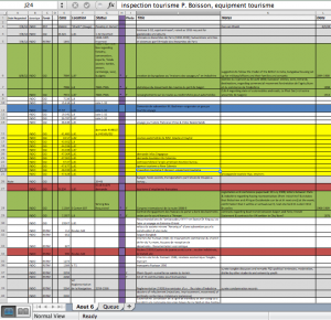
My Excel Notes: I know this made sense at one point…

After a speedy bootcamp introduction to data this week, I now realize the incredible importance of creating a sensible workflow and metadata structure as I am doing archival research. Historians don’t necessary call this process ‘data-collecting,’ but looking at the process that way could be an useful way to save time and not feel overwhelmed. The topics this week didn’t necessarily address organization and workflow, but in our discussions about cleaning/scraping/visualizing data, it reminded me to think about the basic components needed to produce good data.

1. Organization is Key

For historians,’data-collecting’ is akin to semi-purposefully/randomly reading old documents with a theme in mind. With the ease of digital photography, OCR, and more and more online databases, many scholars including myself fall into the trap of ‘over-collecting.’ Although over-collecting can be helpful to make more thorough and better supported arguments, your data won’t be of any use if it’s not organized. Most simply you need 1) a place to store the metadata (data that gives information about other data, e.g. title, author, date, publisher) of each record and 2) a way to insure you can find the original file. Some scholars do this by an excel sheet and subfolders in their harddrive. I have personally used Zotero to input my metadata and Dropbox and Mac Timemachine to continually back up my data. Although it might seem to take a lot of your time, detailed recordkeeping will prove useful when you return from field research and begin your writing stages.

  • Other useful pre-archive tips to keep in mind : Link
  • A full guide to archival research including a ‘record keeping sheet’ that can be an example for your metadata schema: Link

2. How can a Historical Text translate to Data?

In my own research on Vietnamese travel stories, I deal with a lot of narratives and reports that don’t automatically translate into ‘hard’ data that can be easily visualized or manipulated. Like other disciplines that do close readings of texts and qualitative analyses, history can seem antithetical to large datasets and quantitative analyses. However, data-oriented methods such as ‘text-mining’ seem to be making their way into changing traditional humanistic inquiry and research. Essential to analyzing large and small data sets is the actual collection of metadata that describes the object. This is no simple task though because it also involves the larger question, “what do you as a researcher want these objects to say/show/prove/demonstrate?”


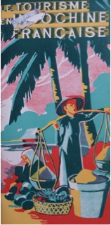
Tourism in Indochina Travel Brochure

I have just submitted to my committee my thesis titled “Where People and Places Meet: Travel and the Spatial Identities of Indochina, France, and Hue in 1920s-1940s Vietnamese Print,” where I examine tourism advertisements, socio-cultural reports, and travel stories, or du ký, to understand how travelers ideologically ‘mapped’ places with cultural, colonial, political, personal significance through the publication of their travel experiences. As you can tell, this study was quite textual and theoretical in nature.  Even though I have extensively read and analyzed these texts, I did not extract these sources for data in a consistent method. I started to reflect how I could input relevant components into a table (such as traveler name, gender, age, group size, destinations, and transportation), and in doing so, I have already begun to look at my research in a different way. I asked basic questions such as “How do these texts relate? How are they different?” to “Are there more isolated journeys or group journeys? What are the primary modes of transportation represented?” 

I am currently brainstorming different ways of translating these textual representations of movement into a visualization, such as a map of the popular travel routes with a temporal component to understand global events and transportation developments. Hopefully by next week’s blog post I will know a lot more about visualizing data and space and get a better sense of my project.


Creative Commons

I first learned about Creative Commons licenses last semester when I took Anthropology 370 with Ethan. We were encouraged to read up on what the licenses were and choose the one that suited us best for our class blog posts. I read up on the options then but until now I hadn’t actually read up on the real ideas behind Creative Commons. The internet has really changed the way we look at creative works. These days works are a lot more open to collaboration. People can combine, re-mix or re-use —. While copyright law is still very important, it’s not very well-adapted to the technology of today. I think creative commons fills this gap.

Creative Commons allows for custom licensing that is much more flexible than traditional copyright law. While traditional copyright still has its place, Creative Commons is great for may works, especially online. Creative Commons does raise some interesting questions about intellectual property. To what degree is your work your own? How much access should others get to it? How can other use your work? The most open creative commons license allows for others to do pretty much anything with your work as long as they credit the original source to the creator. It could even be distributed commercially. This is a far cry from traditional licensing. The story Ethan told about his own book that was released online under creative commons licensing is what really got me thinking about this. The fact that someone distributed his book commercially in a slightly modified form, and that it was fine under the licensing seemed so odd to me. While I like the idea of things being open source and open to remixing by others, allowing others to use it commercially is a step too far for me. However, that brings up one of the coolest aspects of Creative commons. You get to choose exactly how others can use your work. So this blog post can be (and is) available for remixing but not commercial use.