Monthly Archives: June 2013

Closing in on the Finish Line and the Topic of Political Correctness

As I am writing this post, I realize that I didn’t write one for last week when we first started developing.  At least, I don’t remember posting one so I apologize.  This week has been extremely chaotic for my personal life so it is no wonder that I keep running into so many road blocks with my writing.  On Wednesday, my parents and youngest sister almost died in a serious car accident that completely totaled their vehicle and turned it into a convertible.  Thursday my laptop crashed as I was going to shut it down and I lost all of my research on one of my topics for the project so I have to redo it.  And then today, Friday, I woke up and checked my bank account in order to make sure a bill payment went through only to find out that someone on the other side of the country was using my account to make fraudulent purchases.  Very chaotic, indeed.

Away from personal.

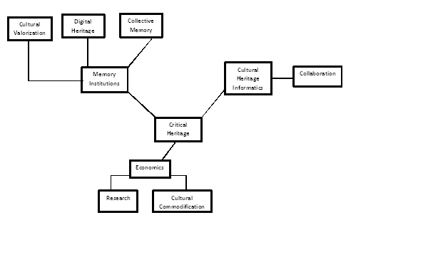
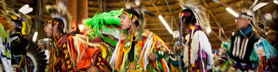
Last week when we decided the teams and roles for all of our people, I ended up in content where I typically end up.  I originally wanted to be a part of web design but I tend to thrive in content and research due to my areas of interest.  Besides suffering writer’s block due to my preoccupied mind, I also had an issue with something I typically try to avoid: being politically correct in terms of ethnicity and race.  Without giving too much of the project idea/theme away, I can comfortably say that one of my topics deals with civil rights and the issue of racial discrimination.  This is an issue for me because I am always unsure of what is politically correct to label someone.

Being the modern university student that I am, there are many things that I believe I am better about than my parents such as eating healthier, managing money better, actually getting a degree, and not labeling people.  My generation has had an issue with labels since middle school when bullying was terrible enough for assemblies and everyone had to listen to faculty rhetoric about how labels are obsolete and everyone is human…and labels are bad. On repeat.  I got it, I get it, I’ll keep getting it.  I try my hardest to not label or belittle anyone and I feel like I generally do okay, but it is impossible to get away from labels in the social sciences.  I mean, my degree specialization is in ASIAN studies.

This is why I am having one of my issues with this piece on civil rights.  A lot of literature labels people as African American, Asian American, Native American, white, etc.  But if I use these labels then I am erasing Caribbean Americans and including them as African Americans.  Same with European Americans that have darker complexions or are ancestrally from Africa.  I would be taking away Chinese Americans, Japanese Americans, Filipino Americans, Korean Americans, etc. and labeling them as Asian Americans.  And not all white people are equal!!  I am so tired of being ‘othered’ in classes that cover issues about race because I have fair skin.  Italian, Irish, and Polish Americans were not always considered as equal, it’s a large misconception.  The topic just becomes too touchy when race is involved and yet race can’t be taken away from the topic because it is the key reason behind the topic.

Civil rights is just a difficult topic to write about while trying to include everything.  If civil rights was an easy topic, than there wouldn’t be so many civil rights violations going on today.  Or rather, human rights violations disguised as civil rights issues.  It’s impossible to be politically correct all of the time or even some of the time because no matter what, you are going to offend someone.  Try to at least keep that in mind if you visit our site once it is finished.

Project Planning and Management Tools: Group Thinking and Writing through Google Docs

This week we came up with the gameplan for our “Detroit Digital” project, and used a variety of tools to help us in the process. Along with the variety of ‘group tools’ such as collective brainstorming, individual written reflection, and small team discussions we also used the following digital tools: Google Docs, Base Camp, and GitHub. In the first (and most difficult) stages of our project, we had to come up with a project that stitched together the broader narrative and doable specifics of data. This process was incredibly challenging and involved a lot of reflective thinking and discussion. However, Google Docs and Google Docs Spreadsheets was incredibly helpful as a platform for multi-staged collaborative thinking and writing.

We used google docs to compose our official vision document and a more detailed workplan. As a platform Google Docs is simple, sleek, and has a low barrier of entry (fully on cloud, no need for account, although a linked Google account makes things more manageable). As a space for collaboration, Google Docs can be very effective if tasks for a group are specific rather than general. For example, when writing up our vision document, only a handful of individuals contributed to changing the text while the majority of the group added comments to the side. Although the comments were overall helpful, they did not move the process forward without a more thorough in person, followup discussion. Furthermore, Google Docs does not ‘track changes’ in the same way as a word processor that allows for clearer comprehension of who made changes and what was changed from the original document. However, when given a more specific task such as full authorship on a particular section of the workplan (a great idea by our wonderful project manager Taz!), Google Docs was an effective planning tool for a group to quickly contribute, discuss, and amend.


Data Driven

One of the biggest difficulties I’ve had so far with our project is coordinating the data we have with the story we want to tell. With the projects I had done previously everything fit together easily but our website has proved a bit more challenging. I’ve been working with our music visualization. Before we even began we had to tweak our original idea, and we had to change direction again after we had gathered the data. Ethan told us time and time again to make sure that our visualizations were data-driven but the message hadn’t quite sunk into until I was fighting with data that couldn’t do what we wanted it to. Coming up with ideas was easy but wrangling data was much more difficult. Additionally, while two weeks seemed like a lot of time at the beginning of the field school the time passed quickly once we actually began working. I had anticipated that the most difficult part of this project would be the actual nuts and bolts of the coding, but now I would say that synching our ideas with the data was most difficult. While figuring out the technical side of things can be quite difficult too, it’s also more straightforward. When you have code that’s not working, you do though and debug. If you can’t get a feature to work, you find out another way to do it. But if the data isn’t there, there’s nothing you can do. Without the time or resources to research something yourself, you’re limited to what others have and what you can gain access to.

Characteristics of information architecture

I want to talk a little bit about the information architecture of our website, because that is what I have been spending the greater part of the last week coding. If I’m able to get through this post without once mentioning the number or difficulties I had with the coding experience, I’ll be more happy with myself. However, for future reference, a list of open (to almost closed) questions I have are here:

1. What are the best practices for designing a website which is mainly focused on content-delivery?
a. bear in mind that the content is interactive
b. content are full of color, but not of a single pallette or group of colors
2. What is the shortest possible distance between the navigation of content and the display of meta-project stuff (people page, project about page) that doesn’t detract from the simplicity of the content navigation
a. question whether I’m to use a dropdown list OR a zone that moves the rest of the page down to reveal meta-project stuff OR link to separate pages.
3. will ANY persistent panels (header, footer, or side navigation) detract from the focus on content
a. especially as the site progresses to incorporate more visualizations under each category WITH the possibility of these visualizations having more user control as our development expertise improves.
4. misc color choices.
5.. “Related pages” = y/n

These questions should all be informed by the relative simplicity of themes. There are three themes: looking, speaking, listening. Reflecting on this choice, although it was less of a choice and more of a recognition of time constraints, it seems like the concept creation period needed more time allocated to it and that maybe we should have delved into it earlier in the month. Speaking to the possibility of integrating additional visualizations, people decided that a “coming soon” dialogue would be put somewhere. But this kind of restricts the complexity of visualizations. Skills improve and interests change. This is crucial to the ‘fieldschool’ model of the course. And something I think everyone who works in the area of area of mapping regrets is not having the data at hand for scaling up the complexity. What would a visualization look like, for instance, if it counted user input? What if it relayed social media chatter? What if it spawned mobile-friendly tools?

Charts, Charts, Charts!

This week we’re moving beyond the maps and into (soon to be) charted territory. We’ve chosen to play around with XCharts, which is a javascript library for what else — charts — that works alongside the d3 library. Though we’re not sure how deep we’ll be able to delve into the scripts, I think it will be a good starting off point. It took a few hours to figure out how things are set up and the basics of manipulating the style, which was hindered by a few errors on XChart’s quick startup instructions page. I had to do some “Google mining” to find out that XCharts is still incompatible with d3’s newest version 3, which XCharts fails to mention on their page. Linking to d3.v2.min.js instead of d3.v3 seemed to do the trick; though I must admit that at this stage in my skill level, most of my successes are pretty much based on luck and trying what seems to be the same thing over and over 😉 Another frustrating thing is that their documentation and examples pages are honestly not really that helpful unless you know quite a bit about javascript. It’s all a little over the heads of us at the field school, which is why we’ve chosen to all work on these charts at the same time so we can figure it out together.

So far I’m happy with the look and the basic data of XCharts, but trying to overlay multiple series and to implement background “time periods” with rectangles is proving frustrating. Also, the need to input the data array into the html document directly is pretty time-consuming. We’ll see how they all turn out in the end. Since we have a lot of data spread out over the 20th century, most of our charts will be line graphs, but we also have a few subject graphs that we’ll be experimenting to see what we can make that will best represent the data we have. We may have to leave XCharts and turn to another tool for those if we don’t like how things turn out. This seems to be the testing phase of the project as we try to uncover the best visualization we can build.

Messrs. TileMill, MapBox & MapBox.js

Last week was an incredibly busy week at the Fielsdschool. The first half was dedicated to planning our final project as a group; while the second half shifted to working in teams (Tech, Design and Content) to start building. By Friday, the tech team had managed to successfully generate, wrangle and clean a formidable bucket of data, and were moving quickly onto constructing visualisations. It’s not too much of a giveaway to say that one of the visualisation toolkits we’re using is a TileMill, Mapbox and Mapbox.js combination. These 3 tools provide the best way for us to build beautiful map tiles and map layers offline (TileMill), host them online (Mapbox) and carefully customise their functionality (Mabox.js). So far, I am finding a lot to reflect on and/or value in these tools:

The ‘return on investment’: The objects you can create using TileMill are disproportionately delightful (there’s no other word for it) to the amount of work it takes to gain and apply the skills needed to use the application. On Friday morning, we built two test maps that meet our purpose, look distinctive and contain great features like image pop-ups. To do this on top of TileMill’s most basic functionality required some targeted Googling and roughly half an hour. For me, this makes TileMill very valuable: while it isn’t necessarily easy-to-use straight ‘out of the box’ without some existing knowledge (i.e. how digital maps are put together and basic HTML + CSS), the reward for learning those basic skills and applying what feels like only slightly more effort is  incredibly significant.

Learning in context: Working with these tools for the final project has reinforced crucial skills in a context that means these skills are more likely to stick. This can be contrasted against Codecademy’s one flaw that another Fieldschooler pointed out earlier: learning skills in a vacuum can undermine effectively deploying those skills outside of that vacuum. So, while I may know how to call a JavaScript function, I might not have a complete picture of when or why I do that. Happily, though, using TileMIll +  MapBox for a distinct purpose means that I am gaining, for example, a more holistic idea of problem solving; and has meant that I know where the rest of the machinery fits in (i.e. how to test your hosted map before you upload it permanently).

(Always) more to learn: Tuesday’s plan is to leap boots n’ all into MapBox.js. It will be interesting to see how this experience shapes my reflections on this set of tools since, generally speaking, I have found MapBox.js significantly harder to use than TileMill or MapBox. Watch this space for an update on how using a JS Library challenges my delight.


Web Skeleton

This week in the CHI fieldschool has been quite a whirlwind experience. In one quick week, we have assembled our project teams, formulated our work plan, and begun work on the actual construction of what we have deemed ‘Digital Detroit’ – our cultural heritage website focused upon the construction of Detroit’s identity. I have been assigned the task of lead content expert, which entails drafting each thematic narrative, distributed amongst my content team.

For me, the most difficult and time-consuming aspect of the project’s planning was coming to an agreement on what the ‘essence’ of the project would be. This means coming to concise conclusions on what each historical narrative would entail, which visualization would fit properly with the associated theme, and what tools would be used to reasonably and efficiently accomplish these tasks. Once that was decided, we were able to coordinate with our team members to accomplish each item of our work plan.

Since web design is such a collaborative process, a project manager and team leaders are assigned the duty of making sure each team member is accomplishing their assigned tasks, as well as maintaining cohesiveness between tech development, content, and design. This is to ensure the fluidity and ease of project development, reducing the chances of miscommunication.

As of week one, we have created the skeleton for our web page, began collecting data and constructing visualization, and researched each historical narrative topic to have a drafted copy ready, opening the floor for critiques and tweaks. Since this is a two-week project, we are on the fast track to successfully developing a user- and visual-friendly cultural heritage website on the great Motor City.

Detroit's Historic Fox Theater

Detroit’s Historic Fox Theater

PechaKucha Anyone?

Last week we presented lightning pitches on geospatial visualization projects – all very interesting ones I might add – for consideration as the 2013 CHI fieldschool final project. The creativity of the fieldschool collective is impressive, equally amazing is the effort required to advance from brainstorming to production of a vision document.  We have progressed from our individual concepts to selection of a project and  establishment of themes, workflow, time frame, and milestones for the group. The processes involved in generating ideas, focusing direction, and outlining criteria for the project brought to mind a larger question I oftentimes contemplate regarding heritage collection appraisal and accession.

I don’t subscribe to the notion of memory institutions as neutral repositories.  My thinking is more in keeping with former Society of American Archivists president and historian, Randall Jimerson.  Jimerson advises cultural memory practitioners to be cognizant of exerting “archontic power” in relation to the intersection between history, memory, social power, justice, and heritage materials.

The notion of being professionally accountable for influencing the construction and preservation of future generation’s memory, informed my pitch.  Comparing UNESCO’s World Heritage Sites in the U.S. and National Park Service National Heritage Areas; I presented an idea to examine each organization’s heritage listings, noting the absence of over-lap between the agencies and  proposed mapping  heritage resources that have not been included.  As a result of my pitch, I drafted the following concept map:

concept4

I intend to use this as a creative problem-solving device to parse the concept of  “showing hospitality to the stranger” (Jimerson, 2009) when addressing archival silences – in this case, heritage silences – to identify narratives for inclusion. This could be a means for locating communities with heritage materials for preservation, digitization, and database management activities.

Jimerson, R.C. (2009). Archives power: Memory, accountability, and social justice. Chicago: Society of American Archivists.


You mean we have to play nice with others?

For the past 4 days we have been developing and planning our final project. It has been an experience to say the least. Trying to find agreement between 10 people who have really never designed a project before has been an interesting and enlightening process for me. And it has to be completely finished in only 2 weeks!!

I honestly must admit that I’ve never been a member of a team like this. I hate team projects normally. I’m accustomed to choosing my own ideas and following them to my precise specifications, whether that be in a class paper, a semester project, or my senior thesis. And I spent all of grade school and high school being that one kid who runs things. College has kind of trained of that out of me since professors are pretty quick to tell you your ideas are just plain wrong. But I’ve mostly only worked on individual projects, so I still controlled my own ideas. The field school is a totally different animal.

We have to work with other people. It’s impossible to control this project individually — not only is it too big to do alone but  to do so would be to its detriment, as we each have different skills and interests. This is one of the main reasons why I’m drawn to digital humanities and one of the main reasons that I am sometimes reluctant. Learning to contribute, to delegate, and to give productive feedback are all critically important skills that are not typically taught or practiced in college courses. But they are required in the digital humanities.

This is all a new kind of experience for me, but I think I and the rest of the team are adjusting well. Our entire team has been doing a great job planning and designing this project, and I think it come together to be something pretty cool. Get excited.

CHI for a Historian-in-Training Part 2: Mapping a Narrative

Since my last post on ‘translating’ a document to data, we explored tools to visualize space such as CartoDB, Mapbox, and Leaflet and toyed with some data tools such as Tableau and Google Fusion Tables. With this short introduction to spatial and data visualization, we were handed the task to come up with a group visualization project.

Throughout our discussion for the group project, I realized that one of the primary issues we confronted was the important although often nebulous distinction between a visualization project and the mapping of cultural heritage. Even in my own brief proposal, I realized that my understanding of a ‘visualization’ was very much linked to maps and spatial representation. My idea was to integrate in some form several detailed and beautiful historic maps of Saigon that are housed in the MSU Archives & Historical Collections in order to understand the evolution of Saigon as a city, administrative base for the Republic of Vietnam, and development over the course of the Vietnam War. As in my example, overlaying ‘maps on maps on maps’ could be a useful tool to understand historic events and change over time, but lacked the dynamism of a data intensive narrative. This distinction has pushed me to think deeper about what I want to do and what is possible. In the case of a lot of historic themed projects, neat data is hard to come by and must be collected, organized, and cleaned up before it can really tell a story. It looks like for my own projects I will have to begin back at that step before I can create a visualization that integrates both space and data.

Although I might confess that I still might not fully understand the difference, I think I have a better sense now of what constitutes a good visualization–a combination of data and a narrative.